
Your Website Isn't Failing Google's Mobile Usability Test (we promise)
If you’ve owned or managed a website over the past decade or so, then chances are, at some point you’ve gotten a confusing, stress-inducing email from Google Search Console about your site’s supposed Mobile Usability issues. But regardless of what the email from Google says, we promise, your website (probably) doesn't have any Mobile Usability issues.
If you’ve received a troubling email from Google about your site's Mobile Usability, then this article is for you. We’re going to help you understand the events that trigger those emails, what your site would look like if those warnings were actually true, and why it’s probably safe for you to ignore these emails altogether.
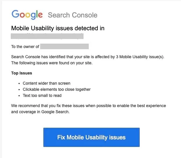
You know the email we’re talking about. The one from Google Search Console that usually reads something like this:
Search Console has identified that your site is affected by 3 Mobile Usability issue(s). The following issues were found on your site.
Top Issues
Content wider than screen
Clickable elements too close together
Text too small to read
We recommend that you fix these issues when possible to enable the best experience and coverage in Google Search.
What are Mobile Usability issues?
Mobile Usability issues are any issues that prevent your website from providing a good experience for users on mobile devices. Generally speaking, most Mobile Usability issues are, in fact, styling issues, which can be traced back to the style attributes added by your website's CSS files.
Styling attributes give web designers and developers the ability to alter your website's appearance by adding size, color, spacing, font size, and other styling elements to your website content. These style attributes also allow us to design unique versions of a website that are specifically tailored for desktop and mobile screens, optimizing the user experience on both platforms.
The way your website appears visually is controlled by CSS “style” files. A website's content, on the other hand, is controlled by a totally different set of files, which for the sake of clarity, we’ll call “content” files.
Website Content vs Website Styling
In order for your website to function properly, your “content” files and “style” files need to load at the correct times, and in the correct order. If your content and style files load properly, and at the appropriate times, your website will look and behave as expected.
BUT, if your website’s content files load before the style files have a chance to load, then what we're left with is an unstyled, skeletal version of the webpage that's not optimized for mobile or desktop devices. This stripped down version of the webpage contains the correct content, but lacks the style elements that make a webpage attractive and usable on mobile devices.
Many warning emails from Google Search Console are false-positives
When your site's style files don't load properly, that skeletal version of the webpage loads, and that’s what triggers the mobile usability warning. If you receive a Mobile Usability warning from Google, go to your website and do a visual inspection of your webpage. If it doesn't look like the image below, that’s good news, because it means your warning was a false positive.
The image above shows us what a webpage looks like when the content loads, but the style elements do not. When there’s no CSS markup, the page lacks those critical styling elements that make it easier to use, especially on small screens like mobile phones.
Without styling, we lose all the most crucial style parameters, including the ones that contribute directly to mobile usability:
The padding between clickable elements (clickable elements too close together),
The width of the content in the viewport (content wider than screen),
The font sizes that make content easier to read (the text is too small to read).
Why does Google think my website has no style?
Now here’s where the trouble begins. Google Search Console’s Mobile Usability metrics are triggered ANY time a webpage loads without those critical styling elements, even if it’s a momentary hiccup in an otherwise healthy load cycle.
Even if your site's Mobile Usability "issue" only lasted for one second during an otherwise healthy pageload, you'll still get a warning email from Google.
Google’s crawlers are set to send a warning EVERY time the skeletal, content-only version of a webpage loads into the viewport, even if it’s quickly replaced by the correct, full version of the page a second or two later.
The email should read 'Mobile Usability Issues Detected… at some point'
In practical terms, Google’s Mobile Usability warnings have a hair trigger, and are liable to go off when there’s even a slight, momentary interruption in mobile usability. Most often, those “interruptions” only last for a fraction of a second. But Google doesn’t measure the length of the infraction, only that it occurred at some point during the reporting period.
To make matters worse, Google’s Mobile Usability warnings are a one-way street. Any interruption in usability will trigger a warning, but there is no mechanism to “cancel” that warning when the page finally loads correctly. Even if the interruption is only a fraction of a second long, the warning email still gets sent. Google Search Console only warns us when something goes wrong, and they don’t cancel the warning when something goes right.
In the image below, note that Google has indicated the exact day that the Mobile Usability issue occurred. Rather than an ongoing issue, we can see here that the issue was a momentary blip in an otherwise issue-free month.

What should I do if I get the Mobile Usability warning from Google Search Console?
If you receive the Mobile Usability warning email, the first thing you should do is head over to Google Search Console, and check to see which pages are failing the test. You can do this by going to search.google.com/search-console/mobile-usability, or if you’re already logged in to GSC, look for the “Mobile Usability” menu item in the left sidebar menu. If your website has Mobile Usability issues, the offending pages will be listed here.
Once you’ve located the Mobile Usability screen, check to see if there are any failing URLs. Click on one of the failing URLs, and visually inspect them to see if your failing URLs appear normal. If you don’t see any problems, return to GSC and locate the button that says “Done Fixing? Validate Now” and click it. The warning should be removed within 48 hours.

What causes interruptions in mobile usability in the first place?
Interruptions in mobile usability can be caused by a number of factors, but are most often triggered by server-side issues like increased network traffic, but they can also be triggered by a user’s slow internet connection, an outdated browser attempting to load a page, image and page caching issues, updates to your website theme, or platform updates.
Fewer Mobile Usability issues on managed platforms like Shopify
The best way to avoid Mobile Usability issues is to use a managed website platform like Shopify, and work with an experienced Shopify developer to customize your storefront. Shopify storefronts are optimized for mobile devices by default, greatly reducing the need for mobile optimization and troubleshooting. What's more, Shopify has their own servers, Content Delivery Network (CDN), and database management systems, which greatly reduces the amount of troubleshooting required to optimize for mobile devices.
If you received the Mobile Usability warning email, and your website is on Shopify, there’s a good chance you received a false positive warning. Verify the warning by visually inspecting your website’s pages to see if they’re loading properly. If your pages look “normal,” then congratulations, you can safely ignore that email from Google. We promise.